
How to Create an Interior Design Material Palette
One of the most important — and often overlooked — steps in the interior design process is creating a considered material palette.
Before selecting a kitchen stone, timber floor, bathroom tile or paint colour in isolation, I want to see how every material works together.
Because great interior design isn't about matching. It's about balance.
What Is an Interior Design Material Palette?
A material palette brings together the key finishes that will define an interior — stone, tiles, timber, paint, fabrics, tapware and metal finishes — so they can be viewed as one cohesive scheme.
At Hunt & Design, we'll physically lay these materials together and look at how they interact in real life.
Not individually on a screen. Not just in our heads. And definitely not based solely on a Pinterest board.
We want to see them together, ideally under natural light.
This allows us to assess the things that aren't always obvious online: undertones, texture, scale, warmth, contrast and the way different surfaces respond to light.
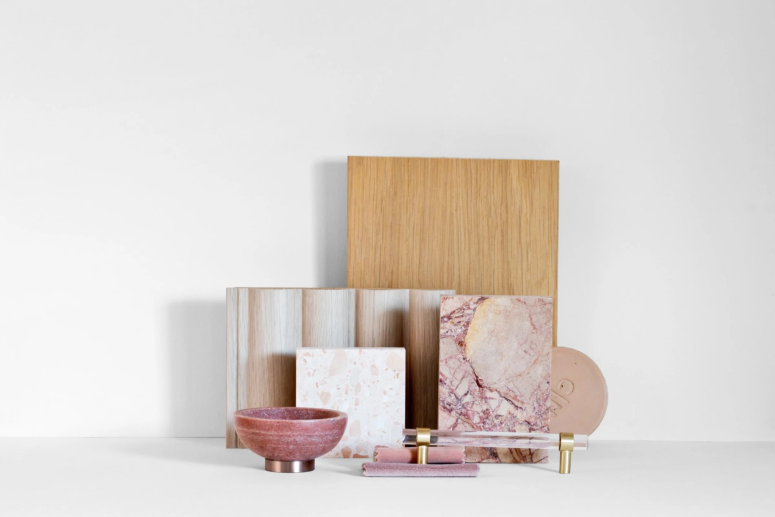
Why You Should See Your Interior Finishes Together
A finish can be beautiful on its own and still be completely wrong for the overall scheme.
A brass that's slightly too yellow can change the feeling of a stone. A cool white can suddenly make a warm timber feel orange. A marble that looked subtle in isolation might become incredibly dominant once it's sitting alongside your other finishes.
And sometimes the opposite happens.
You introduce something unexpected and suddenly the entire palette clicks.
This is why I recommend gathering physical samples of your major interior finishes before committing to them.
Don't Try to Match Everything
One of the biggest misconceptions about creating a cohesive interior is that everything needs to match.
It doesn't.
The most interesting interiors are layered. They combine different textures, tones and materials while maintaining a sense of balance.
For example, a palette might combine blue terrazzo, softly veined marble, warm brass and crisp white Venetian plaster. None of these materials necessarily "match", but together they can create a beautifully balanced scheme.
The key is considering:
Warm versus cool undertones
Smooth versus textured surfaces
Natural versus manufactured materials
Matte versus reflective finishes
Areas of contrast and visual rest
How materials change in different light
Always Test Your Materials in the Actual Space
Once you've created a material palette you're happy with, take your samples into the room where they'll actually be used.
Light has an enormous impact on colour and materials.
A paint colour that looks warm and beautiful in a showroom can read completely differently in a south-facing room. Stone, timber and metal finishes can also change significantly throughout the day.
Look at your samples in morning light, afternoon light and under your proposed artificial lighting before making your final decision.
Your Material Palette Is the Foundation
A well-considered interior shouldn't feel like a collection of individually beautiful things.
It should feel connected.
Taking the time to build your material palette at the beginning of the interior design process gives you a foundation for every decision that follows — from flooring and joinery to furniture, lighting and styling.
Great design is all in the layering. Your palette is where that story begins.